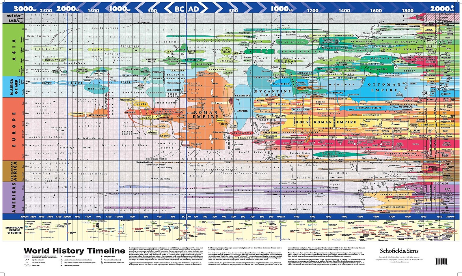
“It is impossible to show everything that has happened in world history on a small poster. The main part of this Chart shows the rise and fall of the great empires and nations through history. It is arranged according to continents, and where possible continents that are next to each other on the globe are next to each other on the chart. It shows how people moved out of their homeland to conquer new territories, sometimes far from home. Each continent is shown in a limited color range, for example, Europe if red-orange-yellow. You can easily see when a European state took control of a country outside Europe because its color remains ‘European’ even though it is outside Europe. The length of the color shows the length of time the empire lasted and the width shows how extensive was the territory they controlled…"
more: World History Timeline - Vivid Maps


No comments:
Post a Comment